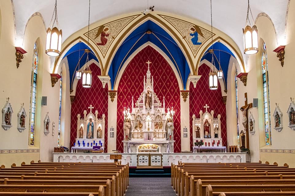
I know we all have our particular tastes. But it seems to me that liturgical decorations and paint colors should try to placate the masses not inflame them.
This is a beautiful Church and it is nice. Some may love it. But the colors behind and above the altar are simply too harsh, too loud and too overpowering. Muted colors would have helped. Or maybe the side chapels should have had a more mellow color on the walls.
What say you?
8 comments:
The point of this palette is to mark the different spaces while not having the altars blend into the back wall. I'm hesitant to agree with you until we establish what color schemes were prevalent during the era in which this church was built. I suspect that we have become so detuned to color after 50+ years of whitewashing that schemes that were typical of that era are jarring to our modern eyes.
The altar cloth is wicked crooked. Tone down the red A LOT, and you're moving in the right direction.
To this day, I look at St. Anne's and that box attached to the back wall and I do not understand what the architect was trying to achieve. It's a rectangle, with panels, almost icon screen-like, but it's not with an arch in the middle. It's muted, it looks to be well made / good cabinetry, but, what purpose does that box actually serve? The rectangle beneath the curved ceiling is also puzzling despite the arch in the middle as well as the arches in the liturgical furnishings. Just wondering "why?" could make this space as distracting as the one with the unfamiliar color palette.
I'm trying to like the new carpets but, aside from one in front of the altar, I don't understand the purpose of the others. A floor with a pattern, or, inlaid medallions might be more effective than a collection of carpets. To me this is an attempt to address a perceived shortcoming of this space and its design by adding more and coming close to creating chaos. It's not bad, but it really isn't good either. From above, the sanctuary now has eyes, a nose and a mouth.
Either tone down the red or the blue
It's fine just as is. Only Philistines would object.
William,
Then count me as a Phillistine. The design is stunning, the color palette actually detracts from it. Now maybe in person it is more harmonious than this photograph depicts.
TJM,
The photo is probably reflective of the way it looks however, modern camera (including phones) make so many auto-adjustments that it could appear more vivid than it really is. That said, to my eye it's bright, but not excessive. In the Philippines, a prevalent style there relies on bright wall colors and gold/gold leafing on the retable, altar and ambo. To some, it is overwhelming, perhaps overdone, I like it after acclimating.
ByzRus,
You may be right!
Post a Comment