UPDATED: The third photo is my former parish in Augusta, Church of the Most Holy Trinity, restored in 1996. Completed in 1863, during the height of the Civil war, both churches are Neo Romanesque Revival.
Matthew Hoffman, somehow I deleted your comment. But I don’t like the color scheme at all and it doesn’t go with the Romanesque archItecture. It could have been decorated better too. I find it uninspiring and tiresome to look at.
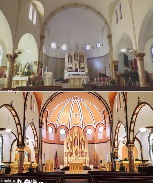
It looks very 1920s to me. It's not my favorite, but I like it better than the before, which is too stark looking. I like that the statues on the side altars are now framed with paint like a sort of reredos.
The "butter" color on the atlars, ambo, pedastals, etc, is unpleasant. It looks like it is echoed in the apse ceiling as well.
What I find least appealing, though, is the very dark brown (?) trim on the edges of the arches and on the ribs in the apse ceiling, as well as the crosses painted in the arches. Too much contrast. I've never been a fan of that rose color used in the apse and above the windows in the nave.
But, Fr. Michael Kavanaugh, I think that rose color would be a nice shade for rose vestments on Gaudete and Laetare Sundays instead of the "pink" shades we too often see. I'm thinking of Pepto Bismol or bubblegum.
Regarding the walls in the nave/apse, the idea does not seem bad - just the execution. As for the high altar, table altar, side altars - they do not look cohesive. It just doesn't work particularly that rose color that looks very 1950s. If it was my project to lead, I would have gone back to historical photos letting them be the guide for restoration.
The church is St Monica in Cameron Texas. A Google search will take you to a Facebook page with extensive before and after pictures of the project. It's interesting to see more closeups.
I don't think the renovation is finished. It looks to me that they plan to replace the round windows under the giant umbrella with traditional arch shaped windows. I'm assuming that is the reason they are kind of painted in.
It looks like they are going for a Spanish look, which I like, but it looks a bit odd in what I assume to be a transitional phase. I think the color will be terra cotta, which can look pretty awful before the paint completely cures. I like the color of the pillars, but I wish they didn't look like giraffe necks. The dark outlines of the arches tie in with the dark pews.
Maybe the arch, sometime in the future, will be finished in copper or gold leaf? Maybe the light fixtures will be replaced with black iron Spanish pendants? Looks a bit odd now, but it has the potential to be really beautiful.
Either one is an improvement over the "worship space" we are stuck with here in South Georgia's liturgical wasteland (Our Lady of Perpetually Barren Halls and Walls).
Holy Trinity is clearly a cohesive space that looks true to the intent of the original design. Unfortunately, it makes St. Monica look, at least to my eye, a bit garish with it's unpleasant color palate (I like Fr. MJK's description).


12 comments:
Can't see much difference, apart from a lick of paint.
Matthew Hoffman, somehow I deleted your comment. But I don’t like the color scheme at all and it doesn’t go with the Romanesque archItecture. It could have been decorated better too. I find it uninspiring and tiresome to look at.
Meh. Probably a lot of money spent with disappointing results.
It looks very 1920s to me. It's not my favorite, but I like it better than the before, which is too stark looking. I like that the statues on the side altars are now framed with paint like a sort of reredos.
I imagine it looks better in person.
The "altar facing the people" looks out of place.
The "butter" color on the atlars, ambo, pedastals, etc, is unpleasant. It looks like it is echoed in the apse ceiling as well.
What I find least appealing, though, is the very dark brown (?) trim on the edges of the arches and on the ribs in the apse ceiling, as well as the crosses painted in the arches. Too much contrast. I've never been a fan of that rose color used in the apse and above the windows in the nave.
But, Fr. Michael Kavanaugh, I think that rose color would be a nice shade for rose vestments on Gaudete and Laetare Sundays instead of the "pink" shades we too often see. I'm thinking of Pepto Bismol or bubblegum.
Regarding the walls in the nave/apse, the idea does not seem bad - just the execution. As for the high altar, table altar, side altars - they do not look cohesive. It just doesn't work particularly that rose color that looks very 1950s. If it was my project to lead, I would have gone back to historical photos letting them be the guide for restoration.
The church is St Monica in Cameron Texas. A Google search will take you to a Facebook page with extensive before and after pictures of the project. It's interesting to see more closeups.
I don't think the renovation is finished. It looks to me that they plan to replace the round windows under the giant umbrella with traditional arch shaped windows. I'm assuming that is the reason they are kind of painted in.
It looks like they are going for a Spanish look, which I like, but it looks a bit odd in what I assume to be a transitional phase. I think the color will be terra cotta, which can look pretty awful before the paint completely cures. I like the color of the pillars, but I wish they didn't look like giraffe necks. The dark outlines of the arches tie in with the dark pews.
Maybe the arch, sometime in the future, will be finished in copper or gold leaf? Maybe the light fixtures will be replaced with black iron Spanish pendants? Looks a bit odd now, but it has the potential to be really beautiful.
Either one is an improvement over the "worship space" we are stuck with here in South Georgia's liturgical wasteland (Our Lady of Perpetually Barren Halls and Walls).
Holy Trinity is clearly a cohesive space that looks true to the intent of the original design. Unfortunately, it makes St. Monica look, at least to my eye, a bit garish with it's unpleasant color palate (I like Fr. MJK's description).
Post a Comment