UPDATE! UPDATE! UPDATE! I KNEW THERE HAD BEEN A WRECKOVATION OF THIS CHAPEL BUT COULDN'T FIND EVIDENCE UNTIL NOW!!!!!!!!!!!!! ISN'T IS NICE? NOOOOOOOOO! CERTAINLY THOUGH, THIS MAKES THE 2007 RENOVATION SPLENDID! BUT BOTH A SCANDALOUS COLOSSAL WASTE OF MONEY! HOWEVER, I PRESUME THAT VERY LITTLE WOULD HAVE HAD TO BE SPENT TO RESTORE THE CHAPEL TO IT'S 1940'S SPLENDOR FROM THE 1980'S DISASTER AS I BELIEVE BEHIND THE SCREEN IN THE ORIGINAL SANCTUARY WOULD BE THE ORIGINAL ALTAR WITH THE TABERNACLE ON IT, BUT HIDDEN AS A SEPARATE CHAPEL IN THIS WRECKOVATION. THE ENTIRE RENOVATED SPACE IS OF THE THEOLOGY OF NOTHING ANCHORED DOWN SO THAT THINGS COULD BE MOVED AND REFASHIONED DEPENDING ON THE FOO-FOOINESS OF THE PRIESTS OR LITURGY COMMITTEE!
The new altar is just wrong for this chapel which is Loyola's Chapel of La Madonna de la Strada (Our Lady of the Streets).
But the traditional altar arrangement of candles and crucifix helps compared to the stripped down version with only two floor candles. I personally think that floor candles are now outdated and that altars should be long enough to hold the six candles and a crucifix but without making the candles into bars:
I do like the brightness of the renovation, but a more traditional altar would have been a no-brainer.
I don't care for the six columns behind and beside the tabernacle, a bit too foo-fooy and fussy for me.
But it does beg the question, why in the name of God and all that is holy did the committee who fabricated the new Mass think it was so important to have Mass facing the congregation, which led to so many high altars being dismantled, including glorious reredoes, in order to create something modern looking, such as the new altar here?
But worse, much, much worse, the money that was spent on multiple wreckovations and then restorations when all that was needed in the particular church was no new altar or anything else, but simple maintenance and regular painting and perhaps technology updates for lighting, sound and the like. .
Just file this under a colossal waste of the laity's money.
Circa 1940s: Artist Melville Steinfels painting the fresco behind the Altar at Madonna della Strada chapel.

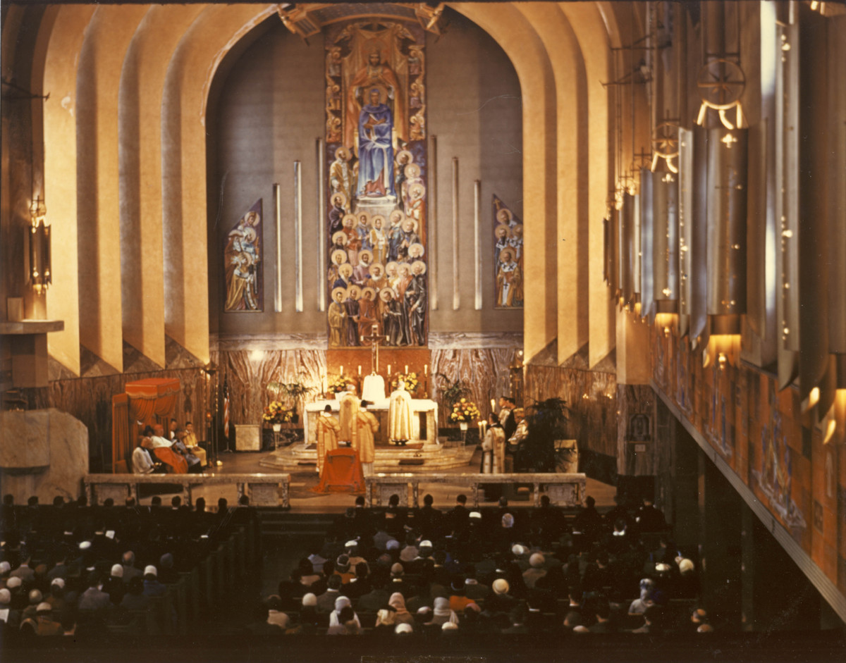
Madonna della Strada original interior (with Steinfels mural behind altar).

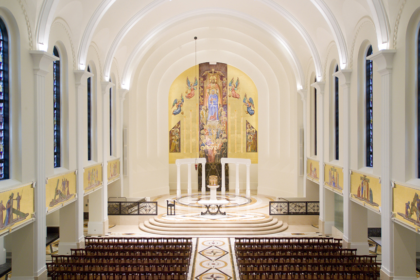
Madonna della Strada interior after 2007 renovation.
Other photos:
The new altar is just wrong for this chapel which is Loyola's Chapel of La Madonna de la Strada (Our Lady of the Streets).
But the traditional altar arrangement of candles and crucifix helps compared to the stripped down version with only two floor candles. I personally think that floor candles are now outdated and that altars should be long enough to hold the six candles and a crucifix but without making the candles into bars:
I do like the brightness of the renovation, but a more traditional altar would have been a no-brainer.
I don't care for the six columns behind and beside the tabernacle, a bit too foo-fooy and fussy for me.
But it does beg the question, why in the name of God and all that is holy did the committee who fabricated the new Mass think it was so important to have Mass facing the congregation, which led to so many high altars being dismantled, including glorious reredoes, in order to create something modern looking, such as the new altar here?
But worse, much, much worse, the money that was spent on multiple wreckovations and then restorations when all that was needed in the particular church was no new altar or anything else, but simple maintenance and regular painting and perhaps technology updates for lighting, sound and the like. .
Just file this under a colossal waste of the laity's money.
Circa 1940s: Artist Melville Steinfels painting the fresco behind the Altar at Madonna della Strada chapel.

Madonna della Strada original interior (with Steinfels mural behind altar).

Madonna della Strada interior after 2007 renovation.
Other photos:


14 comments:
Columns are "foo-fooy and fussy", but prepares 8n engine are just fine and dandy?
Please. . .
The new altar is not substantial enough for the size of the sanctuary. It does rather look like a table one would see on their screened in porch. Other than that, the Church seems rather luminous
Before:
A sanctuary that moves the world because it is unmistakably directed to the divine realm. It is apostolic in design.
After:
A place that moves with the world, unmistakably directed to the people like a hall meant for union meetings. It is mundane in character and design.
First commenter, did you use an iPhone with auto-correct to post your comment???????? What are you writing???????????
Prelates in ermine
On the topic of "before and after", prayers today for St. Marys on the Hill in Augusta---lightning hit their rectory about 8 last night and apparently a total loss, though thankfully the church sanctuary was not damaged. One thing I don't like about the South this time of year---high humidity and unpredictable thunderstorms---but I guess every region of the US has its occasional weather issues!
Those faux columns look ridiculous and attempt to add volume I guess. That table looks minuscule against the substantial backdrop. The tabernacle is awkward and clumsy, it would be nice against the mural.
Bee here:
I haven't been there (to the Maddonna De La Strada) in a long time. When I was attending school there in the 1980's they had the altar in the center of the chapel, with movable upholstered seats in circles around it, and I think no kneelers (can't remember that detail). So some of this renovation seems like an improvement to me, but I have to admit I don't like the altar or even the arrangement of chairs in the sacristy. The seated Bishop Perry looks so out of place, like he's the driver of a huge bus.
Here's my take on these "wreckovations": For us lay people: you know how when you have a huge problem in your life but you spend your time rearranging the furniture and redecorating because you are avoiding grappling with the real issues that must be faced, and it makes you feel busy and productive, but it's really a waste of time? That's what these "renovations" seem like to me. It's the progressives in the Church wanting to feel like they made some progress on their agenda to "renew" the Church.
God bless.
Bee
Anonymous Kavanaugh,
Would you prefer prelates in burlap?
I wonder if "Father" Vosko was involved in the 1980s wreckovation?
What is burlap? Is it a species similar to ermine?
I have never seen a picture of the original sanctuary. It is really outstanding.
Hard to tell.....wait.....is that Joel Osteen walking behind one of the columns?
I like the renovations. But those columns on either side are awful. It looks like something from a Las Vegas casino.
Perhaps it was someone's idea of what an Art Deco altar should look like.
Post a Comment