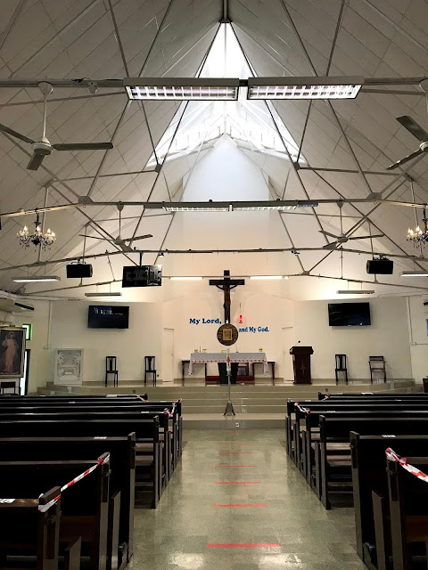
This building is a cheap, utilitarian building. It is ugly. But there are some simple things that can truly enhance it and make it beautiful in the eyes of the beholder. Establish the Tridentine ethos for the sanctuary to include the traditional set up of the altar.
Design areas for statuary that look designed rather than simply hanging statues on the wall.
A new paint job creating some contrasts with some stenciling, not a lot, would help.
Changing the harsh lighting system for something more subdued with spotlighting for the altar, tabernacle and ambo, would help.
Apart from turning this into a parish hall, what else would you suggest?

6 comments:
Demolition?
The overhead light scaffolding needs to, if possible. Indirect lighting on the light colored ceiling would be great. Not sure how to replace the function of the fans, though. Maybe hand out foldable fans made from old parish bulletins.
This may be all they have, all they can afford.
With the girder work above, I would avoid stenciling. Might look too busy.
Remove the screens. This isn't an evangelical space.
Procure white fixtures, including something upon which the tabernacle can rest that's larger than a post.
6 high candles flanking the tabernacle.
Side shrines.
Perhaps create borders with a field of gold behind the altar and tabernacle and side shrines.
Exercise restraint with temporary furniture and chairs.
Keep it simple, clean and as elegant as possible else this space will just look busy and junked up.
Banners. None. Just be Catholic in terms of presentation.
Plants. None. Rarely do they not just look like a jumble. Clean, simple and elegant. People respond to that.
ByzRus,
I almost always greatly appreciate your contributions.
Daniel,
Thank you!
Remove the screens (it's not a classroom or a mega-church), replace with artwork/statues. There's more that could be done, but that's item number 1 imho.
Nick
Post a Comment