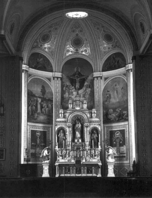
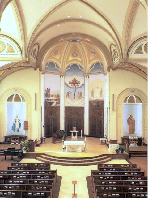
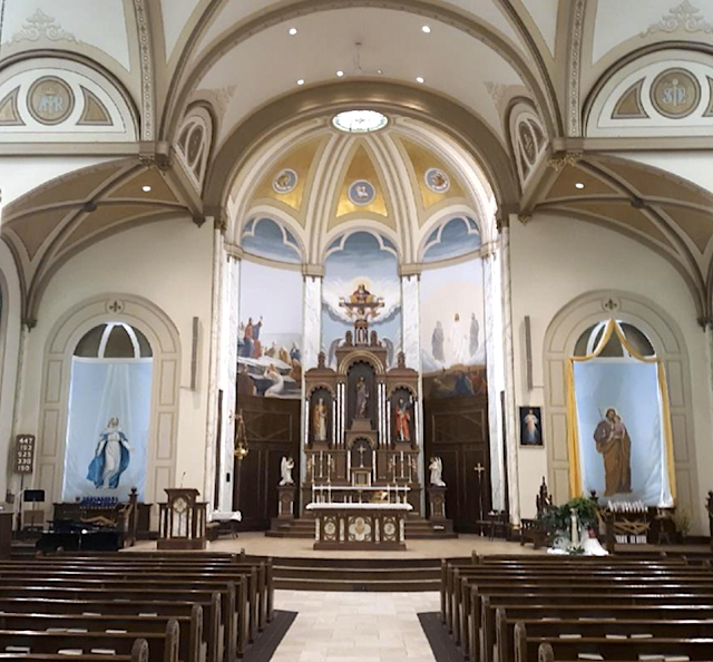
This is how a church in Ohio looked prior to a post Vatican II wreckovation that wasn’t horrible, but a wreck nonetheless less:
Before:
After: The the post Vatican II wreckovation came that wasn’t horrible but the magnificent reredos and pre-Vatican II altar were removed and presumably destroyed:
After/After: Then sanity and money returned and we have this beautiful restoration, but with that all corrupting fly in the ointment. More on that below the photo:
I suspect the added reredos is a new creation but based upon the original unless they stored the original in the basement, which I highly doubt. The major fly in the ointment, though, is that the new reredos/alar is too tall and hides the painting or mural of the crucifixion scene above it. That is not the case with the pre-Vatican II look! Why create something new and not measure its height properly????
They could have omitted the attached high altar, lowered the reredos which would make the free standing altar look as though it and the reredos are one unit.
Maybe for the future an altar railing could be restored that would help.
But overall, I would say that the first renovation could have been much worse and isn’t horrible although the high altar/reredos were removed and the altar railing—destructive and thus deserving the name wreckovation and an act of “desecration” against art.
The after/after is nice, but the major mistake or fly in the ointment is that the new reredos hides the crucifixion painting. That should not have happened!
You can read the story of the after/after here:


8 comments:
The pre-wreckovation photo featured the mural sitting higher in that space. Post-wreckovation, it was either repainted, or if on a canvas, it was adjusted. Regarding the high altar, they either had it executed the way they wanted it, or, an opportunity became available to acquire something much similar to what was there. If so, the predella might not be wide enough to accomodate a detached mensa.
This is what I don't care for with the internet. We're not there. They likely have budgetary limitations like everyone else. As a priest, why not call the pastor there and understand their renovation and the challenges they faced rather than hold it out for public ridicule? Perhaps renovating the murals is just not possible now. To turn your words around: In the St. Martha Chapel, the after/after is nice, but the major mistake or fly in the ointment is that the new crucifix does not match the style of the existing structure. That should not have happened!
It looks like the murals were repainted during the wreckovation (the image on the left is completely different, and the other two are simplified versions of the same scenes).
I can understand why the good folk of St Joseph's wanted to hide the central mural, as it's a strange hybrid of resurrexit and crucifixion scene (with a representation of God that's come straight from Monty Python). It reminds me of that weird ferula that Pope Francis was presented with on All Souls' Day in 2013:
https://vexilla-regis.blogspot.com/2013/11/pope-francis-new-ferula-close-up.html
Oh my ByzRus! Turning a Protestant Chapel which went through an RCIA type conversion and was baptized, Confirmed and Eucharisticized, to a basically good restoration that someone in charge did not measure the height of the new altar/reredos seems to mix apples and oranges. A Catholic altar, tabernacle and statuary placed in any Protestant/Puritan Church clashes with the architecture and original purpose of the building. A San Damiano crucifix and Italianate altar frontal are minor incursions on the Puritanical quality of the building not to mention the statues placed in it in 1955.
Surely you jest by suggesting my most lovely crucifix and altar frontal are on the same level as a reredos that hides a crucifixion scene which could have been remediated by making the new reredos lower in stature.
Fr - Do you have any idea what it would have cost cut down what likely is a salvaged reredos and still have a proportionate, cohesive structure? It's much more involved as I'm sure you are aware than going at it with a reciprocating saw then liquid nails. As for the mural - to me its secondary to that which houses the reserved sacrament. True, it would have been really nice if all fit postcard perfect. I'm not there to know their circumstances and budget. I'm willing to guess this might have been a concession, one that can be addressed with a scissor lift and wallpaper glue should the budget allow for such a correction down the road.
No I do not jest about that most lovely crucifix that is being maligned by being placed in a space in which that just begs the question, why? It looks put there, not placed. Some brassy crucifix with rays coming out the back would more cohesive in your Georgian space as it wouldn't get lost in the back window. There's a protestant church here that is so adorned - it just lacks a corpus as anything protestant generally does.
Hmm, now I realize it's a simplified copy of Reni's Holy Trinity. Oops.
The mural is not at all a “strange hybrid,” but thoroughly traditional iconography called a Mercy Seat.
It does appear that all three panels of the artwork above the original reredos were redone as a part of the first renovation. The midlde one (Mercy Seat) appears to have been completely redone, lowering the crucifixion scene. The panel to its right seems to be the same one but restore or a duplicate but updated. The panel to the left seems completely different than the original. While I prefer the originals and positioning of the center panel, the restored or newer ones are very nice. The lowering of the middle image is interesting and I suppose making it easier to look at.
I do object to placing something in front of the middle painting that obscures half of it. It is unnecessary and quite annoying to me eye and sensibilities.
Fr McDonald, sorry to nitpick but in your title you misspelled “Lasik”
Post a Comment