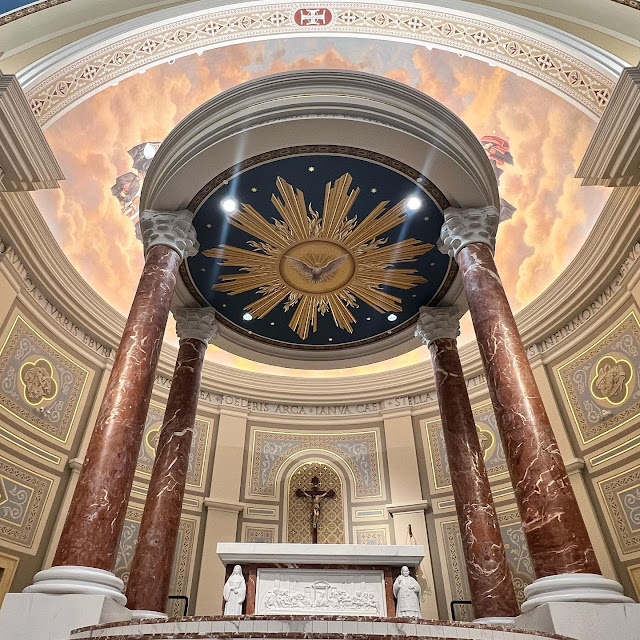
Conrad Schmidt also restored the interior of the Church of the Most Holy Trinity in 1996, although we did not have the resources to do quite what was done in this new church!
BEFORE (ALTHOUGH PLAIN) I LIKE IT, BUT THIS IS A NEW CHURCH WAITING UNTIL RESOURCES MAKE IT POSSIBLE TO DO THE AFTER WHICH FOLLOWS. STUNNING TRANSFORMATION NO? AND THEN THE MAGNIFICENT ALTAR. I HOPE THEY PLACE THE BENEDICTINE ARRANGEMENT ON IT!


8 comments:
That is beautiful. Does he do anything in more muted tones?
The mural above the altar is muted but the ceiling a bit too bright. it could have been toned down, but with time, lots of candle smoke and clouds of incense a more antique patina may developed.
I like what Rolf Rohn did for us at St. Joseph in Macon, in terms of the blue on the ceiling. It actually looked like velvet but has a more muted tone to me than what is pictured in this new church. I don’t know if this will open for you or redirect you somewhere else, but try it:
https://www.pinterest.com/pin/36028865743971063/
After exquisite, but I would happily make do with before.
Conrad Schmitt has been doing exquisite work for over a century. They did the Basilica of the Sacred Heart on the Notre Dame campus snd it is a show stopper
I've seen lots of work by Conrad Schmidt studios, and like so many others, I find it pleasing in so many ways. And yet...
Something is just not quite right. I am not smart or reflective enough to say just what it is. And I feel bound by charity to specify, at least, what my reservation is not. I am not suggesting anything about their work is shoddy, or uncatholic, or bad aesthetically.
If I had to say what holds me back, I'll offer several things:
- His work strikes me as a little cold, or distant, rather than what I'd call warm or familiar. And, it may be that the "warmth" and "familiarity" I am looking for can only come with time, and all his work is too new for that.
- Although it certainly draws on tradition, it doesn't really call to mind many church settings I've actually experienced. Maybe this is a good thing, because that suggests originality? And yet: my reaction is favorable, but not so much that I'm hungering to go back to it.
My reaction may be indefensible, but I share it in case anyone else has experienced something similar, and can give a better account of it than I have.
The white and blue intensity are a little high, for my taste. But nothing a few decades of candles can’t cure, as you say, Fr McDonald. The colors of the victorian era were often quite loud, but we don’t usually see them except covered in years of soot, etc. While not Victorian, it seems like they may be using colors from an age that were, when new, as bright as this. I have noticed that large American Protestant churches use a lot the same shades of blue and white. It makes me think that the space is available for use for something other than worship, e.g. concerts, etc.
Blue, the color of the heavens, we don't have a green sky do we?
In heaven everything will be intense and orderly and quite honestly there is not really that much blue. But where is the mural on the ceiling of pachammama ? The ultimate horror is if some future pastor gets his mitts on it and goes all Fr Fleager on it, liturgical dancers anyone?
These photos make me want to adjust the brightness and contrast on my screen. I wonder if this is a fair assessment and, perhaps, these photos were amped up to show detail. I'm looking at their website, livestream, and it looks much more mellow there (what little can be seen at the provided angle).
Post a Comment