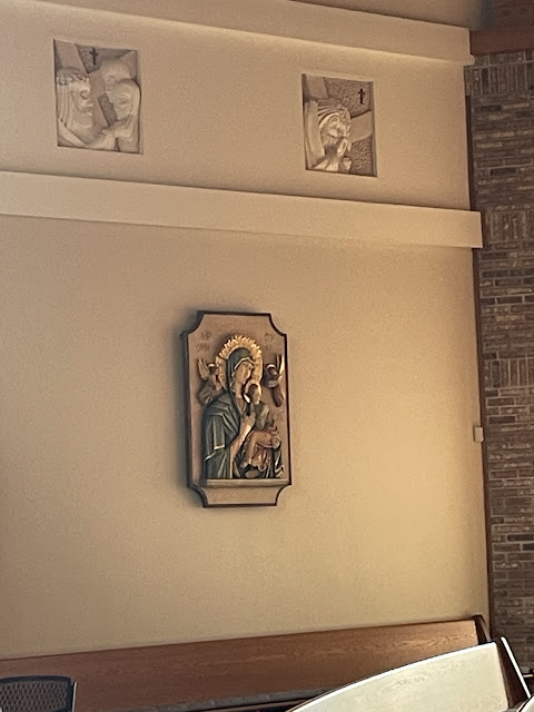
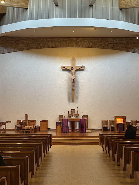
I went to Hilton Head’s other parish, Saint Francis By the Sea, for their Lenten Penance Service.
It was the first time I was there and they recently did a refurbishment of the inside of the church. The entire complex is very nicely done and landscaped and on a beautiful piece of Hilton Head property.
There are only two changes to the formula for absolution, “poured out” and “grant” as you see in the formula below. I realized that I have been saying “grant you pardon and peace” my entire 43 years as a priest, instead of “give you pardon and peace.” I always have been ahead of my time!
I am, though, having a hard time remembering to say “poured out the Holy Spirit” as I still say “sent the Holy Spirit”. Sent is stuck in my aging mind!
Here are the words for the new Absolution formula, which is really a small change and for the better:


10 comments:
The new floors are much better than the carpet. The wall behind the altar could use a little color in some form. What did they do with the organ?
It is in the next to the last photo. Yes the massive wall needs some kind of embellishment.
That's the console, where are the pipes?
I still have to watch myself when "consubstantial" comes up in the creed.
I didn’t see any pipes anywhere, so I thought it was electronic. And yes, I still say “And Also with you”….
That place looks vibrant, so inspirational, filled with young families!
What's the name of this worship space? (it sure ain't a church)
Our Lady of Eternal Ho Hum?
Our Lady of Perpetual Modernism?
Our Lady of Bad Architecture?
Our Lady of Bland Uniformity?
St. Blah?
Colorless Limbo Parish Community?
Oh yeah, St. Francis by the Sea.
How incredibly mass-produced, production-line-ish banal!
Jerome Merwick,
Good ones!
Electronic? Nooooo! It's a really BIG W. Zimmer & Sons, Inc. (Opus 411, 1988), 46 ranks. 2,619 pipes. 5 divisions. 4 manuals. 28 stops. 53 registers. Our Cathedral Basilica organ is considerably smaller.
Pros:
To be fair, it's not bad.
The correct elements are there, inclusive of side shrines.
The current recipe of really large crucifix on the back wall is better proportioned here. This works and looks planned.
I'm mostly indifferent to stained glass windows and like being able to see outside. Trees/foliage are good.
Cons:
Too much clutter in the sanctuary. The one pic from farther back in the nave illustrates too much temporary furniture.
The main fixtures are too small for the space they occupy. Additionally, they are somewhat from their surroundings.
The drop ceiling above the back wall, the way it's finished clashes with the beams and I suspect that shadow is permanent.
The back wall is too large an expanse of nothingness. It reminds me of a tv that lost its signal.
The ambo is not my favorite. It reminds me of a podium in a lecture hall.
This space needs a designer to create backers for the side statues that correlates with something to emphasize the altar and tabernacle in a cohesive way.
A larger altar of repose eliminating the side pillars would fill this space in a more understandable way. What's there looks temporary. Without some heft, it just looks lost.
The stations are nice - maybe too monochromatic.
The plaques are nice but, the way they are placed reminds me of art in the home as opposed to shrines/devotional areas.
Overall, it's not bad and with a little thought and planning, this could really be developed. Spending significant amounts of money isn't necessary either, unless this parish desires significant upgrades.
Post a Comment