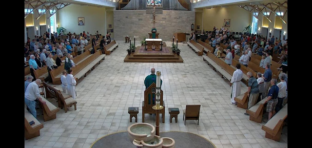
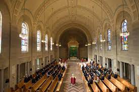
This is Our Lady of Lourdes, De Pere Wisconsin. I like it as noted above. It is monastic, thus traditional. It reminds me of my seminary chapel in Baltimore.
I am not sure I like the ambo’s placement though, but not sure where else to place it. And where have they laid our Sacramental Lord in the Most Blessed Sacrament’s tabernacle? Not sure where that could go unless behind the ambo and then, well, that might be three in a row?
But overall, I like it, but the first row of pews need a modesty skirt, less anyone accuse the priest of voyeurism during the celebration of the Mass! Of course, it appears that these parishioners know this and thus don’t sit on the first pew but rather use it as the modest skirt!
As you can tell, the above photo is a duplicate of my seminary chapel, which, by the way, except for the out of place free standing altar, was never renovated after Vatican II. It is as it always was, except for the free standing altar and the ambo in the middle of the aisle facing the altar:


6 comments:
An October 2021 video shows the taberbnacle on the back wall in place of the location of the credence table in the pic you show.
I can't say that this space is among my favorites. The sanctuary, in its entirety, and at least to me, should have it's own space so that all, including servers are contained within during divine worship. Where it is found, I'm not fond of this blending of nave and sanctuary. The falling water font, to me, is more something to look at than a tool that both teaches about initiation and where churching takes place. There is a fountain that flows like this at my local shopping mall.
It strikes me that this arrangement is more typical of seminaries as I believe was intimated. Even the provided seminary example has a clear delineation between the various spaces. While the subject church's altar, and perhaps the ambo as well are elevated, the linear nature of this arrangement is confusing. I also feel that what to me is a muddling of spaces is teaching believers incorrectly. Perhaps, one could argue, it doesn't necessarily matter what space one occupies, all are more equal. In the East, a church temple would never be built this way. The distinctions that I mentioned, among others, are honored without fail.
Fr. AJM, you so often advocate for the return of the communion rail. Where would it be placed without creating yet another obstacle? Ad Orientem, all united facing the New Jerusalem, how would that be accomplished? The catafalque candle arrangement, impedes access and certainly doesn't follow even current norms regarding ample space being provided for the Triduum, among other major feasts. This to me is a fail. If I were a priest, I would pray not to be assigned here having to deal with this on a daily basis. An extreme reaction? Perhaps. I just think this is a bit silly. The physical structure isn't bad however, the iconography, or whatever that is that adorns the back walls is way too out of proportion relative to the space they occupy. I hope a designer was not paid to provide this experience, or, lack thereof.
Byz - The "opposing choirs" arrangement that Fr. ALLAN McDonald shows in the pic from St. Mary's Seminary in Baltimore was, I feel fairly certain, copied from monastic practice. Although there must be others, the only monastery I have seen without this set-up is St. Procopius Abbey chapel in Illinois. In that location, there are two sets of "stalls" for the monks, but together they face the altar.
A couple of good pix here: https://pipeorgandatabase.org/organ/38867
Taking the monastic model for the formation of diocesan clergy has a few pluses and several minuses, and not only in the spatial arrangement of chapel seating.
Agree with ByzRus, this is a fail. No kneelers? Unsafe for Catholic worship.
Byz - When we visited St. Procopius we were told that the design of the abbey chapel was based on the RCIA. I was left asking, "What does that mean? How does one capture/express a rite in the design of a building?"
Well . . One enters a low-ceilinged, somewhat dark narthex area. Turning right - you're beginning to make a gentle spiral here - you step into a much brighter, airy space where the Baptismal font is located. Turning right again, continuing the gentle spiral, you encounter a "hall" of sorts. The floor slopes down, the ceiling slopes up, and the walls get farther apart as you make your way forward. It is drawing you in toward... At the end of the hall, you turn right again and, BOOM, you are in the very large, very bright space of the quite large chapel.
You enter in darkness, the dim narthex. Through the enlightening of baptism (brighter space) one begins a journey (down the hall) toward the presence of God, found in the celebration of the Office and mass.
All of this is in a properly austere monastic setting. But it actually WORKS!
Thank you, Fr. MJK. What you describe sound like our Christian journey through life, birth, initiation, divine worship and reception of the sacraments.
I'm familiar with the monastic situation you describe, the execution of the subject church, at least to me misses the mark comparatively speaking.
Post a Comment