UPDATE! Here is their First Sunday of Lent Mass and the video shows off the interior much better thn the photos below and I think I would leave all alone except a modified Benedictine altar arrangement.
But you can also see how the Modern Vernacular Mass leaves much to be desired when it comes to "mystery" and "Mysticism" capturing the spiritual imagination in addition to the intellectual approach to the Mass. And the temptation to make the Eucharistic Prayer a proclamation to the congregation rather than a prayer to God is what destroys the ethos of wonder and awe during the Eucharistic Prayer which the EF's style and way of praying the Roman Canon maintains. I just can't watch the priest as he prays it is such a distraction to me personally, so I close my eyes pretending that it is ad orientem!
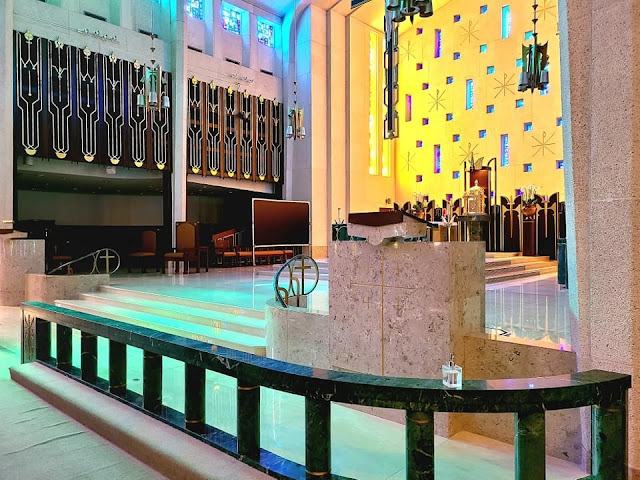
This is St Michael the Archangel Catholic Church in Houston, Texas I think. I saw it on the Facebook page, “I’m Fed up with ugly Churches” although they actually like this one and so do I, except…
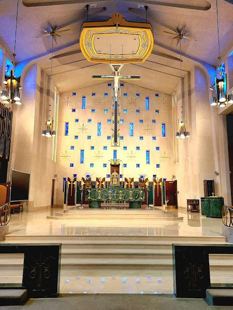


Overall, I like modern church architecture especially those designed on the cusp of Vatican II like this one. I wish there was a photo of it in its pre-Vatican II altar arrangement.
What I find problematic though, is the busyness of the altar’s background and the kind of reredos where the tabernacle is. Against the busy back wall and with a busy looking green altar and a busy looking reredos it just seems to be too much. I would get rid of the faux reredos and wonder if it was there pre-Vatican II or post-Vatican II.
I love the float “baldachin” or corona.
I don’t like the double ambo and these would hide the altar from many in the pews. One would be enough, though and they do match the architecture.
I don’t like the placement of the priest’s “throne.”
I don’t like the baptismal font in the sanctuary.
The side chapel is pathetic.
I like the main altar, but with all the busyness behind it, it seems incongruent with the back drops and itself busy on its front. But I like its placement on the traditional three steps up in the sanctuary.
What about you. I can’t link the Facebook post here but go to “I’m Fed Up with Ugly Churches” and see more photos. I like it overall.
7 comments:
I only wish I could un-see it.
The lines of the Church are fine but the altar is truly hideous
I don't think the sanctuary is any busier than the ornate rococo or baroque beauties you have posted.
Overall I like it and I think it is an exceptional decorative/architectural accomplishment that they have managed to maintain over the years. I suspect the chairs are a later addition - they probably needed to be replaced after some time. But they fit into the overall visual ethos quite well.
From the video, we can see that the amboes don't block anyone's view of the altar.
The presider's chair is hardly a throne. The Baptismal font placement isn't what I would choose, but that is what was done in many places.
It reminds me of Gio Ponti's co-cathedral in Taranto (that's got too much green in the sanctuary too, but it's a lot less cluttered):
https://www.wallpaper.com/architecture/gio-ponti-cathedral-taranto-italy
https://www.atlantearchitetture.beniculturali.it/en/concattedrale-grande-madre-di-dio/
James,
Wow, I think I would have a hard time worshipping in that space.
@TJM
Me too, especially with a fantastic medieval cathedral just a mile down the road.
There's a medieval cathedral in Houston? I lived there for three years. How did I miss that?
Post a Comment